Product Page Enhancements
Background
The product pages for Rite Aid had a great foundation but over time there were some aspects that needed to bring the pages up to speed.
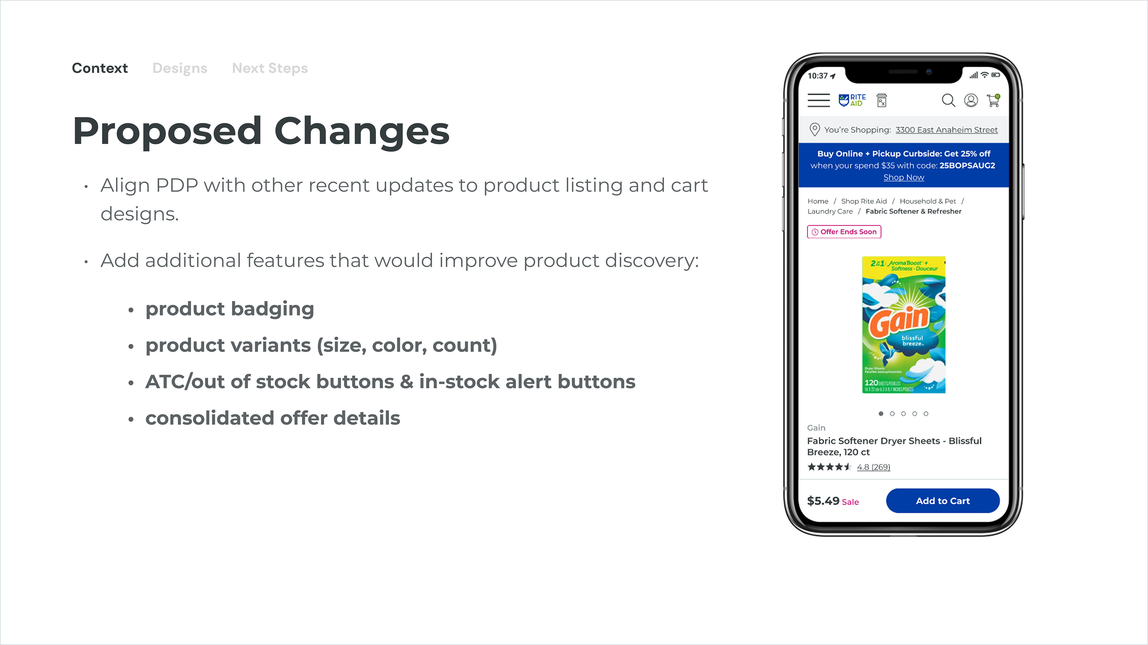
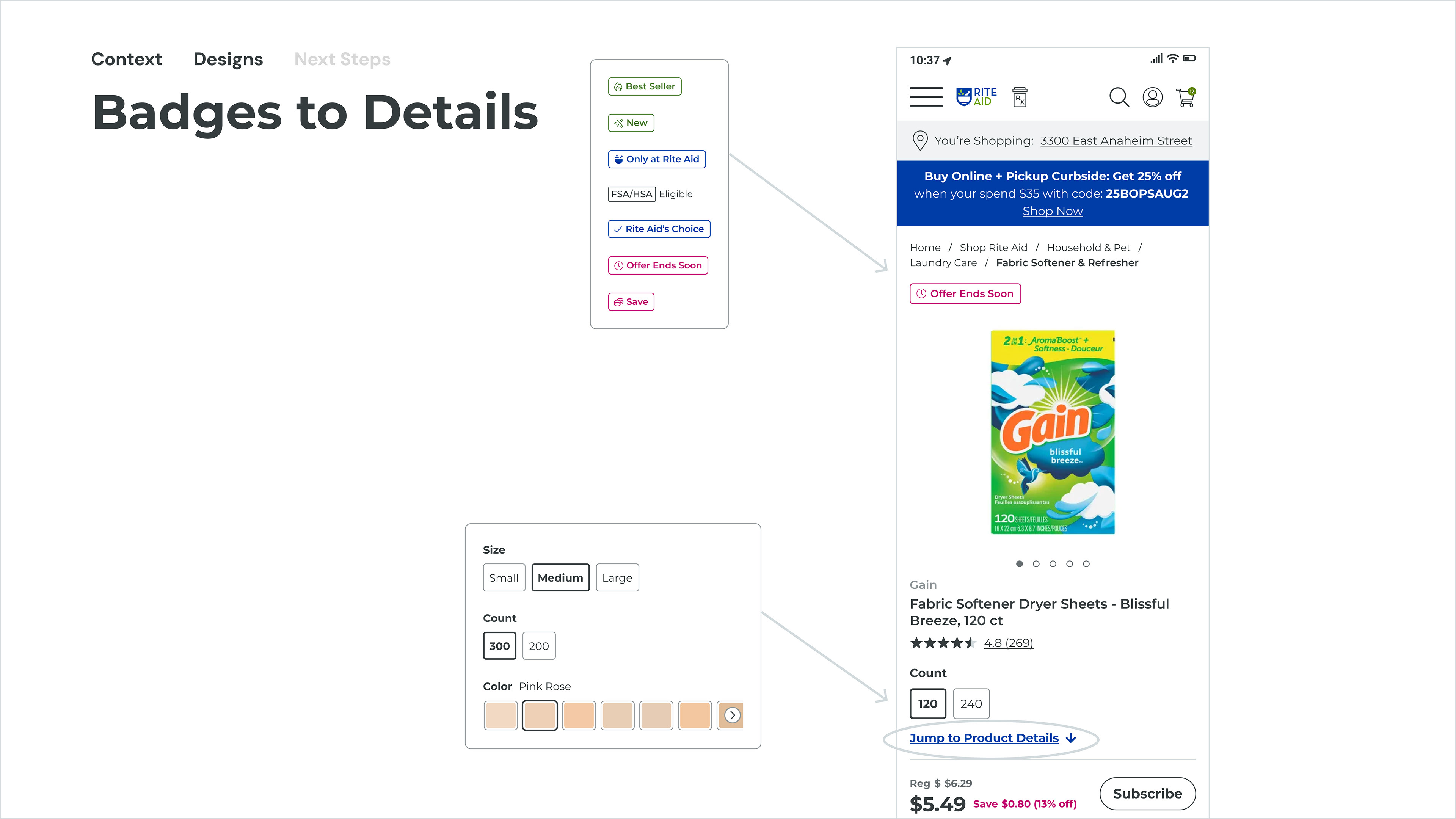
Marketing desired to add special badging to highlight certain products like own-brand, exclusive or special deals.
Variants: Some types of products had different color or size options and the current site didn’t support that.
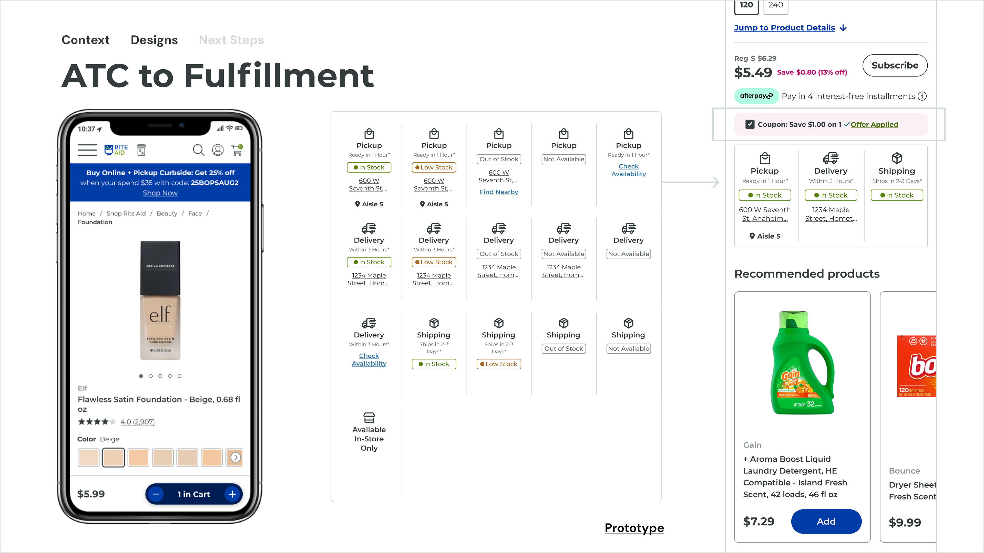
Fulfillment: The options had changed and these needed a better home adjacent to the product image and other information
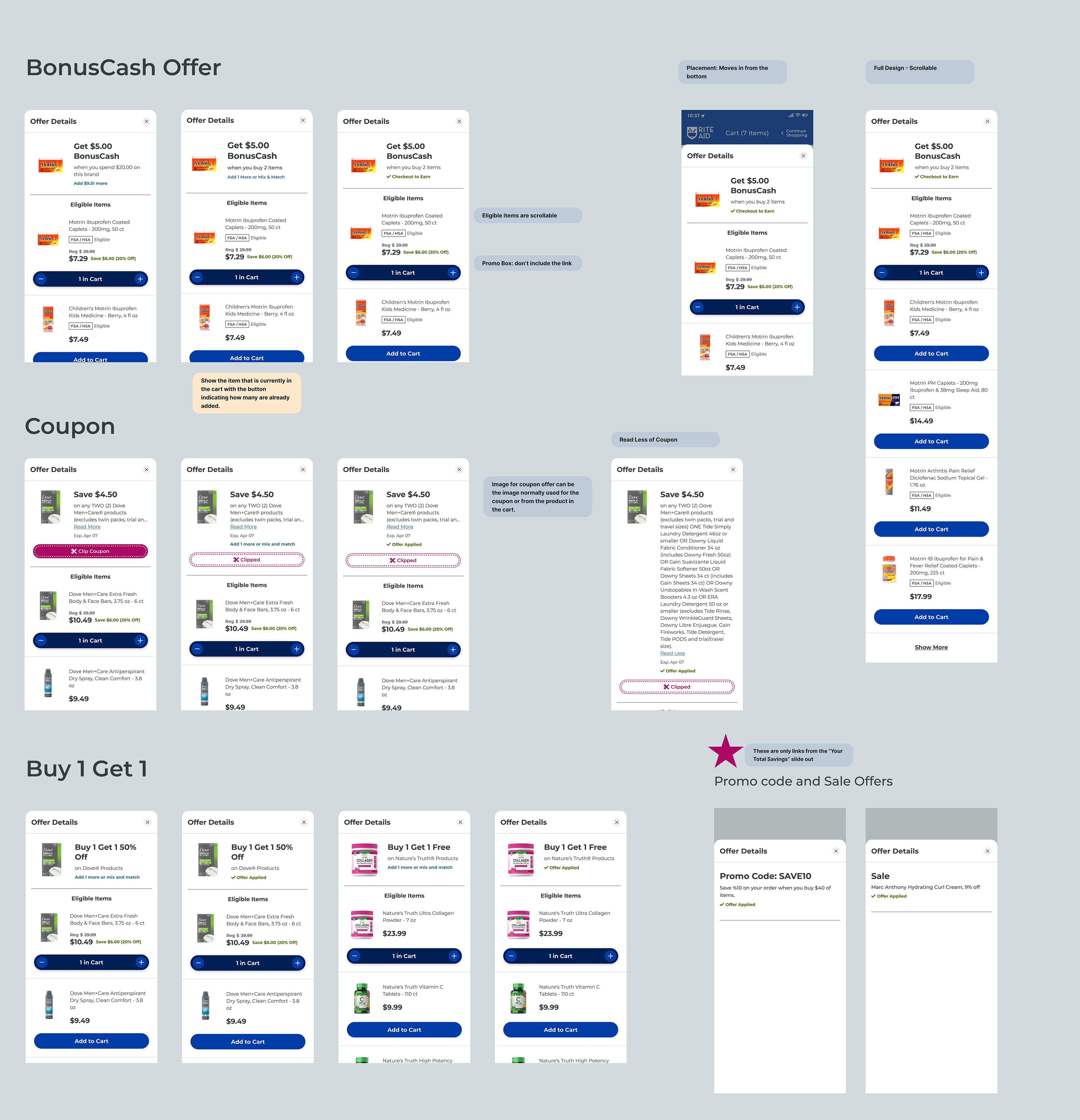
Offers: There were several different types of offers available (coupons, sales, loyalty offers, etc.) and they all had different placement on the page. They also needed a new home.
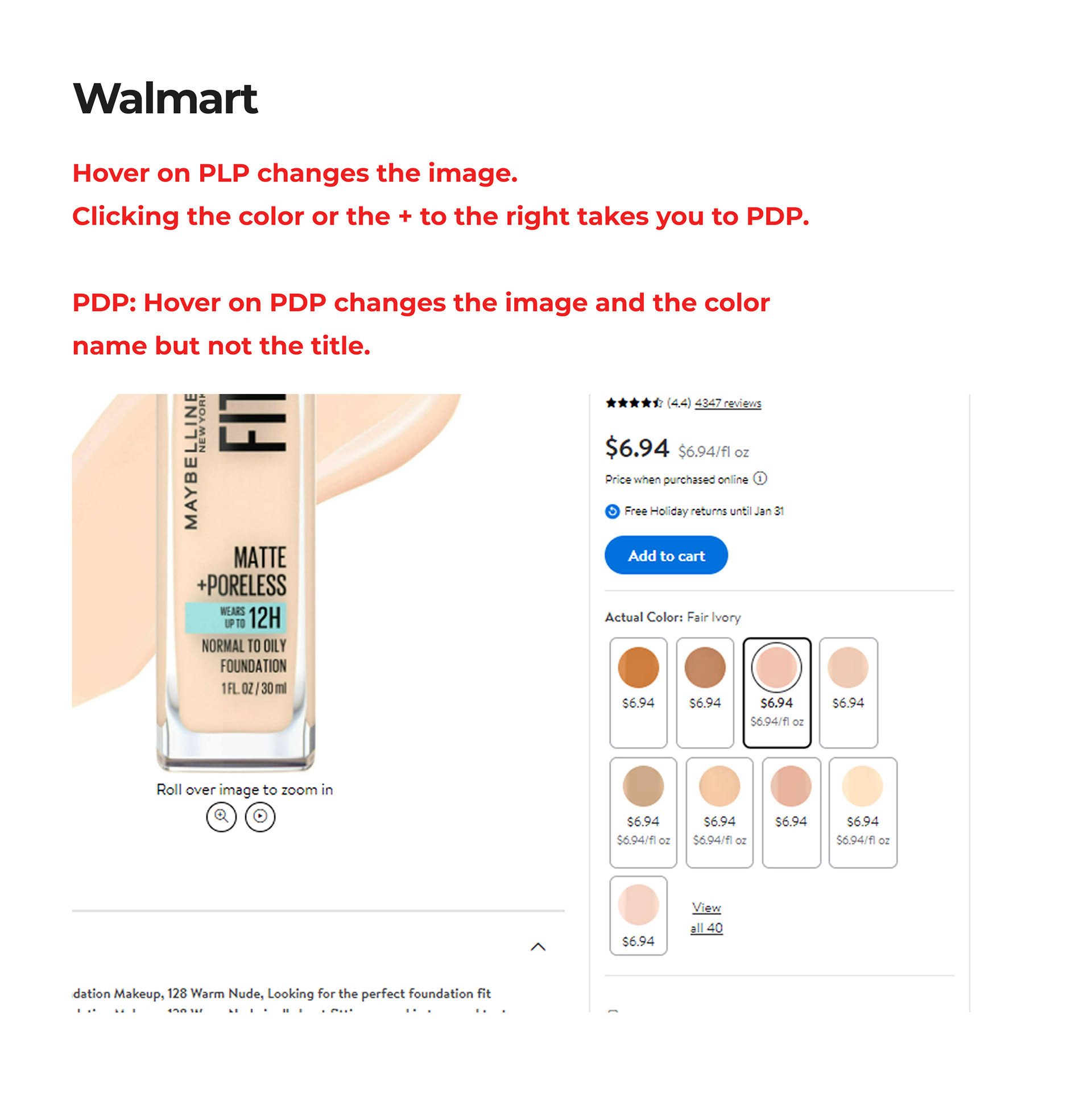
First, my main focus was the variants section of the page. I like to do a comp analysis to begin with so that I can see what has already been tried. It tends to help me see what the constraints will be, what scope I'm working with and it sparks lots of ideas.
Second, the process involves taking the original page and adding in several ideas that might be a good fit for that particular product. There are different possibilities with different product types so the exploration can take some time to find the right fit that works for many different situations.
Third, you need to test and get feedback from stakeholders and other designers. User testing, where possible, takes out the guesswork and validates your work. It can also change the direction of the design completely. The key is to open to new ideas, even at a later stage of design so that the finished product is on point.
The following fulfillment options were worked on by a colleague. They highlight how great user experience is never done in a vacuum. It requires teamwork. It also shows how the process can be complicated but how the end result can be simple for a user.

The biggest challenge for me was the offer summary. Over time, as the business evolved, several different types of offers became available. The company was known by its user base for great deals and the loyal customers were an important and consistent source of revenue. To align all these offers into one section of the page that made sense to customers was the goal.
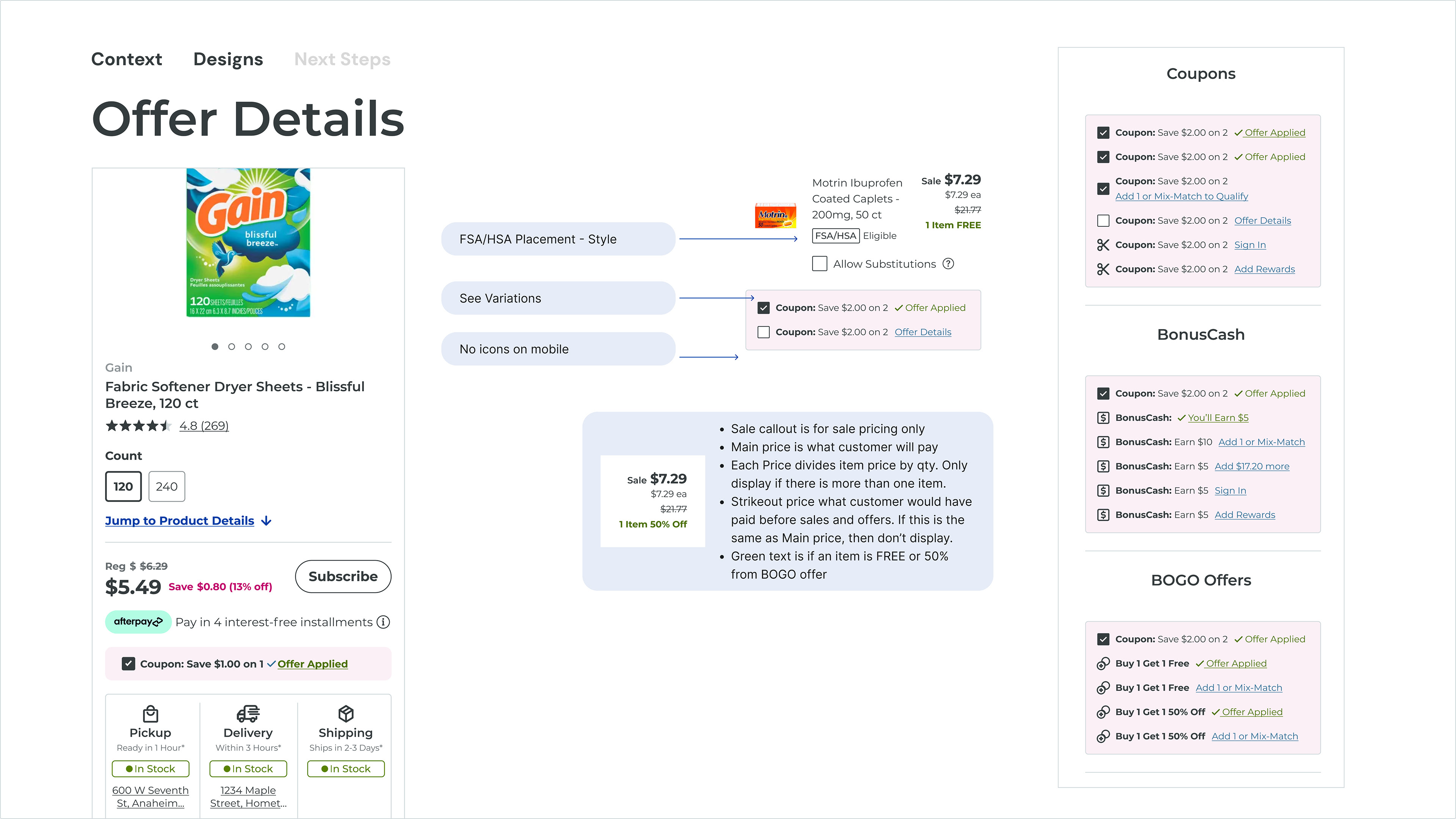
One of my favorite parts was designing the offer details. This integrated a way for customers to clip coupons, add additional products that related to the offer and more. It was a huge change that offered so much to our customers. It took some time to work out how One of the most rewarding aspects of the entire project was meticulously designing the offer details. This critical component was envisioned as a dynamic hub for customer engagement, seamlessly integrating multiple functionalities. We developed an intuitive system that allowed customers to effortlessly "clip" digital coupons, ensuring they could easily access and redeem discounts. Beyond simple coupon redemption, the design incorporated intelligent upselling and cross-selling capabilities, presenting additional products directly related to the current offer. This strategic integration not only enhanced the customer's shopping experience by providing relevant options but also significantly contributed to increased average order values.
In summary, the focus was on four key areas: fulfillment options, product variants, offer displays, and product badging. The process involved initial exploration of design ideas, followed by testing and stakeholder feedback to validate and refine the designs. It was collaborative user experience design, particularly in the development of fulfillment options. A significant challenge was consolidating various offer types (coupons, sales, loyalty) into a single, user-friendly section. A rewarding aspect of the project was the detailed design of offer details, which allowed customers to clip coupons and present related products, enhancing the shopping experience and increasing order values.